
a new company. a new mark
About the time I arrived at Vistaprint, senior levels were determined to refocus the company around "Value to the customer." It seemed that in their meteoric growth, a large percentage of super-successful tech companies tended to lose sight of their customers. And Vistaprint was no exception.
Fortunately, one area where Vistaprint was an exception was in how fast it could change. In fact, within just 18 months of my arrival, where it once seemed Vistaprint never thought of its customers, it was suddenly doing everything it could to drive value through more authenticity, more customer-focus, and more responsiveness.
Now Vistaprint needed an identity to match. The old identity, like the old brand, was inwardly-focused, cheap, and a bit tacky; C, M, Y and K may be the four colors of printing, but to the average customer, they just remind one of "an aging Elvis" (direct customer quote).
Video capturing the development process and saluting the design team as well as ultimately unveiling the new mark at a global sales meeting.
The new Vistaprint needed to present itself as professional, yet approachable. Value-based but no longer cheapo. Multifaceted but always focused on the micro-business owner. Global yet of the local culture. Oh yes, and because we were still Vistaprint, we needed it NOW!
turning A potential TEAM OF RIVALS into a powerful development opportunity
Click to see the range of logo colors
To add pressure to this mix, a concern arose among some senior non-agency management that we did not have the internal creative capabilities to handle such a task.
While I heard this point of view and did appreciate the importance of the project, I personally felt it would send a bad signal to our creative department as a whole were we to farm out such a choice project. Fortunately, in the end, I fashioned a compromise that I believe worked well.
The internal team handled the first rounds of ideation - creating and then narrowing a range of design directions. Concurrently, we vetted a list of external design partners and eventually narrowed that to our choice and eventual partner, Tank Design.
I then reached out and spoke with Andrew Sullivan, one of Tank's founding partners, clearly laying out that I wanted Tank to think of our senior designers as their clients, and that while I wanted Tank's unvarnished opinions and best work, I also wanted the project to serve as a growth opportunity for our senior people.
As the video shows, the process produced not only an outstanding system but also, thanks in no small part to great collaboration by Tank, a once-in-a-lifetime development opportunity for the designers involved.
expanding a newly established mark into a complete brand identity system
A complete brand identity system is more than simply a mark, a few type faces and a color palette. After all, its purpose is to provide consistency of look, feel and messaging across disciplines, geographies and time. And clearly that requires more than simply line and color. With this in mind, and working in parallel with the teams designing the mark, I also launched and led a team tasked with defining and codifying the brand voice. The result of this effort is captured in the Global Brand Book which was subsequently provided to every Vistaprint employee and every partner with whom we work. It also served as the basis on which all of the following materials were created.
Carrying the essential bold color blocks, large areas of bright white and minimalist adornment, the stationery system is at once corporate and modern.
Reflecting the personalization so central to the Vistaprint brand, each employee has the option of four color palettes and their own monagram on their business card.
Carrying the custom monogram font forward onto a full range of personalized employee products allowed us to provide branded personalized incentives to employees.
The new graphical treatment was finally carried over to customer-facing elements like our packaging.
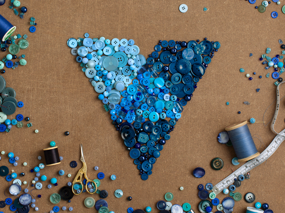
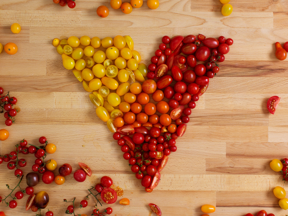
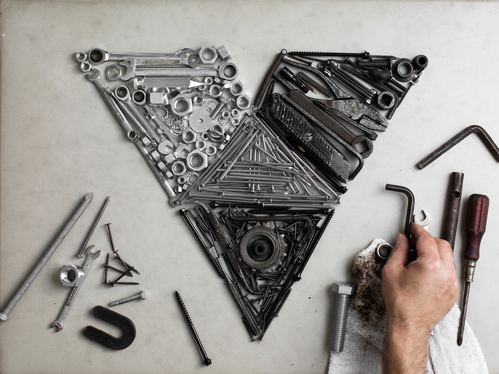
celebrating the launch by commissioning a series of photos to be shared on Facebook, Twitter and Instagram
Combining our new graphical mark with our history of serving micro businesses, we metaphorically showed our position in our customers lives by making our mark out of real world elements from the daily lives of a tailor, a bakery, a machine shop, and a florist.